
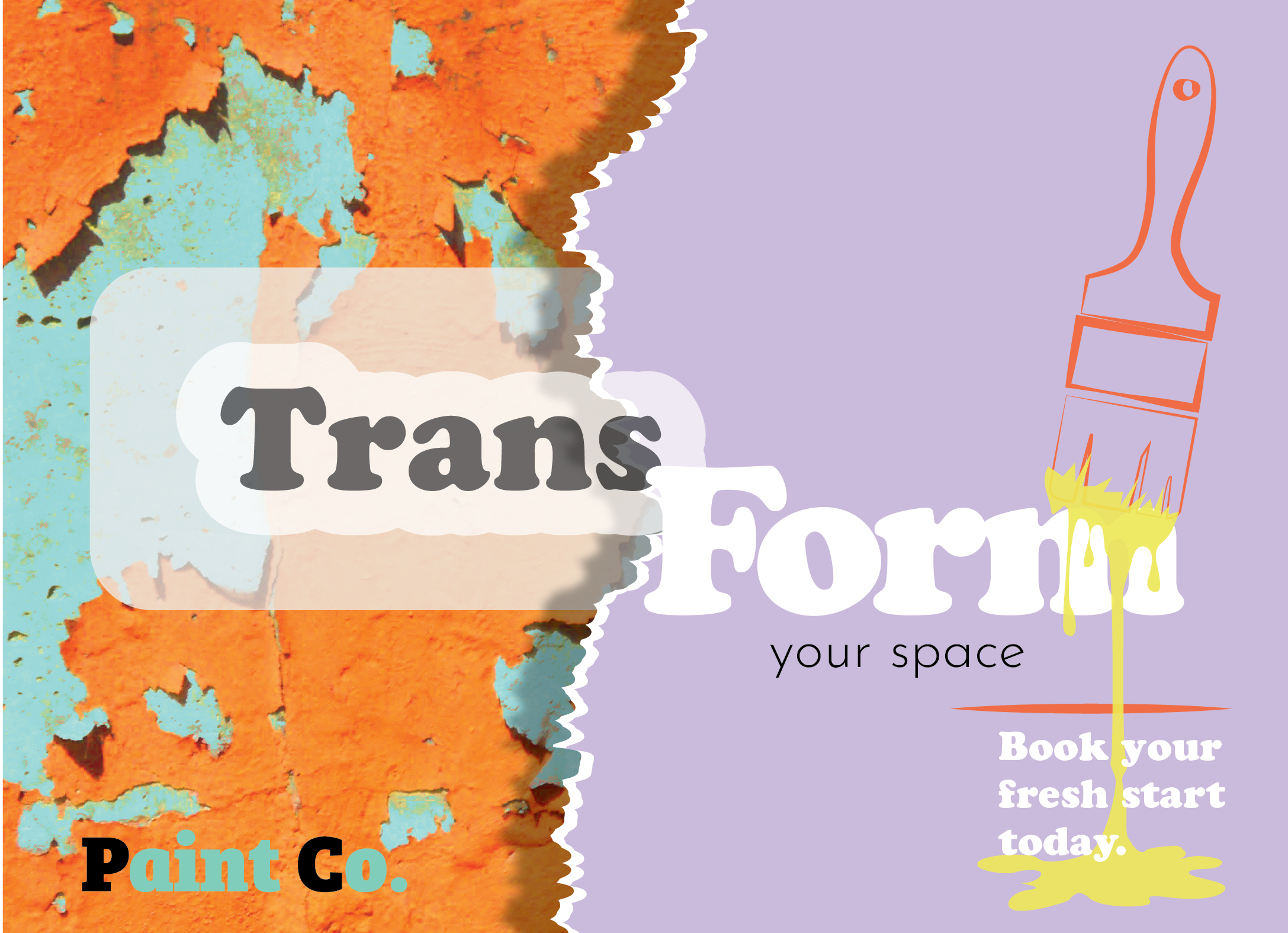
Paint Co.
Create a fun postcard to hand out to prospective clients.
The Brief
The brand needed to stand out within a crowded home improvement industry while avoiding the overly corporate or generic aesthetic commonly seen in painting and renovation companies.
Market Insight
Many competitors relied on neutral palettes and traditional branding, creating an opportunity for a more energetic and personality-driven visual identity that would feel memorable and approachable.
Positioning Direction
The goal was to create a bold and playful brand identity that reframed home painting as a fresh start rather than just a service, helping the company connect emotionally with customers through colour, transformation, and optimism.
Visual Outcome
A vibrant visual system featuring expressive typography, high-contrast colour combinations, layered textures, and custom illustrations designed to communicate creativity, energy, and transformation.