
Stay Wild Field Guide
Focused on differentiation within the outdoor education industry through typography, grounded colour systems, and more intentional messaging

The Brief
Stay Wild needed branding that reflected both professionalism and adventure within an outdoor industry crowded with similar visual identities and messaging.
Market Insight
Many brands in the outdoor education space leaned heavily into rugged aesthetics and generic mountain imagery, creating little differentiation between competitors. The brand messaging was all very similar and heavily focused on adventure.
Positioning Direction
The goal was to create a brand that felt grounded, educational, and intentional while still reflecting exploration, connection, inclusivity and the backcountry lifestyle.
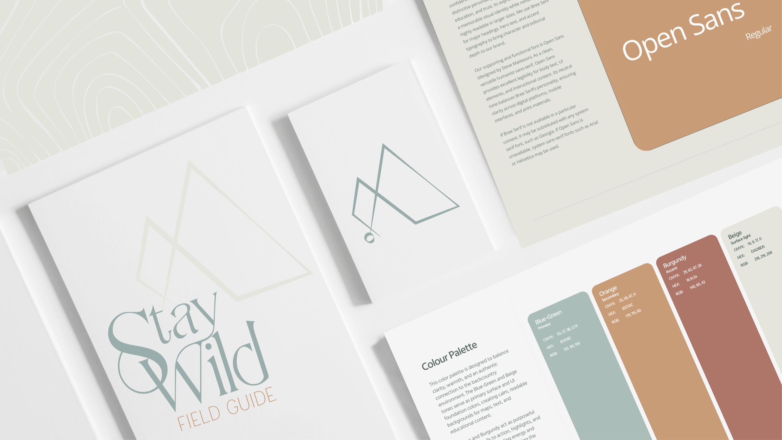
Visual Outcome
A clean and cohesive identity system built around strategic typography, natural colour palettes, and custom graphic elements inspired by topography, tree rings, and mountain landscapes.